Pro Tips for Creating a Digital Mood Board
Who doesn’t love a mood board? It’s the modern technology geek’s dream collaging activity.
The truth is, you can write about a look and feel until your face turns blue, but there’s power in actually being able to see it. Mood boards ensure everyone – including writers, designers, and account managers – are on the same page when it comes to your brand vision, campaign, or activation.
So put away your glue sticks, scissors, and magazine stacks, and use these tips and tools for making a digital mood board like a pro!

PhotoShop
While there are other applications – Google Slides, PowerPoint, Pinterest, Niice, Evernote – to create your mood board in, PhotoShop is our platform of choice. Not only is the functionality layered, it comes with a solid amount of resources to learn, tweak, and perfect your mood board-making skills.
Free Tools
If the idea of using PhotoShop or the applications noted above to create your mood board feels overwhelming, test a free tool like Canva. Canva provides templates that allow you to easily plug in your imagery versus resizing images and layers on your own.
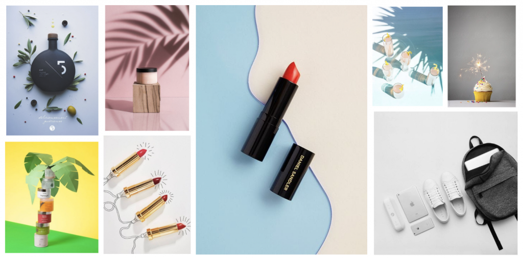
Turns out there’s more to search for on Pinterest than just creative uses for mason jars! When pulling imagery for your mood board, tap into Pinterest searches. Follow photographers, artists, and influencers that have a knack for curating eye-catching content.
Stocksy and Unsplash
We’ve all gone down the rabbit hole of cheesy stock photography looking for a gem, which, luckily, we don’t have to anymore. Social assets tend to have a very specific visual aesthetic that works depending on current trends. Photographers submit their photography to sites like Stocksy and Unsplash and provide imagery that might be just the visual tone you need to define the look of your brand.
Texture
I once heard someone say, “Don’t assume your audience is stupid.” Not every image on your mood board has to be an obvious choice. Textures like textiles can provide a powerful aesthetic tone for your mood board and give designers a great example to pull from.
Color Palette
Choosing your color palette before pulling images is imperative. Do some research and make sure you have a solid range from pops of colors to neutrals for things like fonts, borders, and backgrounds.
Fonts
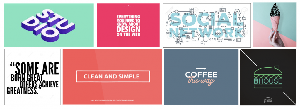
Often times people don’t know what type of font they like until they see multiple options. Consider adding a few visual examples of font types you think would be a nice addition to your social content, or additional creative projects (website, brand guide, printable assets, etc.).

Illustration
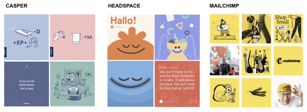
More and more brands are tapping into the power of hand-drawn illustration in their assets. Do your research and consider whether illustration is an appropriate addition to your brand’s visual tone and include a few examples of artists that resonate with your style.

Faces
This one might seem strange, but it’s an important thing to consider. Some brands’ social posts receive more engagement when they showcase actual users of the product (a.k.a. User Generated Content or UGC) versus models. If this is an important element of your brand’s visual look, pull the type of UGC you’d like to include. Consider your qualifications for what makes a great piece of UGC content and get specific so that it seamlessly fits into your content stream.
Abstract Imagery
When pulling your images and creating a “feel,” consider each asset as part of a larger picture. Creative framing, up-close imagery, shapes, and angles can help diversify content types and build an aesthetically pleasing mood board or feed that looks clean, streamlined, and cohesive.
Ready, set, start creating!


I don’t think the title of your article matches the content lol. Just kidding, mainly because I had some doubts after reading the article.
I don’t think the title of your article matches the content lol. Just kidding, mainly because I had some doubts after reading the article.
Your article helped me a lot, is there any more related content? Thanks!